Logo Ideas
Hey Bruce
Here are some of the thoughts that I am hoping will drive our identity:
-
I don't want our logo/identity to unnecessarily drive anyone away.
-
I especially want it to be attractive and non-threatening to non-Christians and people who might be skeptical of church.
-
In our vision meetings for our church, our priorities and values revolve around
-
Valuing People – We want to value people regardless of their past or current lifestyle choices.
-
Valuing Life Change and Growth in People
-
Valuing Authenticity – We want to be relevant in the Northwest culture
-
Valuing Creativity – We want to value art and writing, and any type of creative communication
-
Valuing FUN – We want to be the most Fun church in town. At a recent pastor's conference where I listed this in our values, it was pointed out that no other church represented expressed that fun was a value of their church. Apparently this is a rare thing and an important identifier of who we are.
-
Engaging the Mind – We want people to not only have their hearts impacted but also the way they think. We want our services and meetings to be intellectually stimulating.
-
-
I have already contracted with a web service that allows us to change our colors and looks based on our identity, so I am not worried about any specific colors.
-
When our logo is translated onto an A-Sign or banner, I want the name of our church to be bold and noticeable from a distance.
-
One thought that I do have, please don't be limited by this or married to it. One of the ways of communicating who we are has been to share that we want to take Faith, Hope and Love and be the place where those three things all happen. I illustrated this originally with three circles that all overlap, with only one area in common. Circles, triangles, squares, would all work in that illustration.
-
I have seen very few church logos that I have thought were all that interesting. Most of the churches that I like right now use very minimal designs with a small gray piece of art and just a lower case font church name. Many look like the “moto design” that I have included below.
My favorite designs below are:
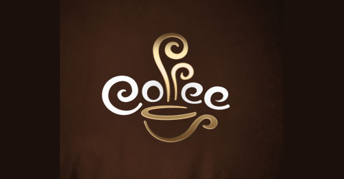
The Get Wired Logo – I like the colors are fun, the design is artistic... I don't like the fact that I don't feel like the cup describes their actual identity. I don't like that the words under the art are so small and not a part of the art at all.
Transformations (the last of the list) – For some reason, this kind of art demonstrates something going from standard to fun and lively. I love what this could communicate for a church. This one is my definite favorite because of how much it communicates. It would look good online, in print, even on a shirt or banner or sign.
I am so eager to see what you creatively come up with. Thanks for doing this!
Mike
![]()
this is too serious, but I like the design.
![]()
This one might is one of my favorites because it is fun, easy to look at and read the actual name of the company. We would obviously want a different design, not a cup, that we could decide on. But it is fun, artistic and eye catching. I would want a bolder name with the identity.

I like that it is artistic and that the design is part of the title.

This one is fun and clever.

I was thinking about the Christian fish here.
![]()
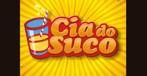
I like the pando one because of the design. It might be too bright colorful for us and too much like software or e-business, but I do like the three boxes concept for a possible design.
This one is more of a nortwestern color, with a clever and fun design.
I like this one because it is fun. I also like that the logo works on top of the colorful gradient behind it, but also does not depend on it.
![]()
I like this one because of the three boxes together, again more for my idea of the union of faith hope and love. The bring colors make me think of computer software though.
![]()
This one is simple and fun, but also super clever. It needs more color and more focus on the design.

This one is fun and tactile. Looks like you can touch it.
![]()
This one is modern and might get old, but is fun and interesting and artistic. If we could figure out what to put in the design, it might be a cool option. It communicates a lot. I like that it is not only fun but communicates transformation just like the word says. I certainly would love to see an entire identity that includes that design and the artistic swirls.